I worked on the re-design of a statistics tool in an existing web application. The previous design was old fashioned and we kept getting negative feedback from frustrated users.
UX Challenges
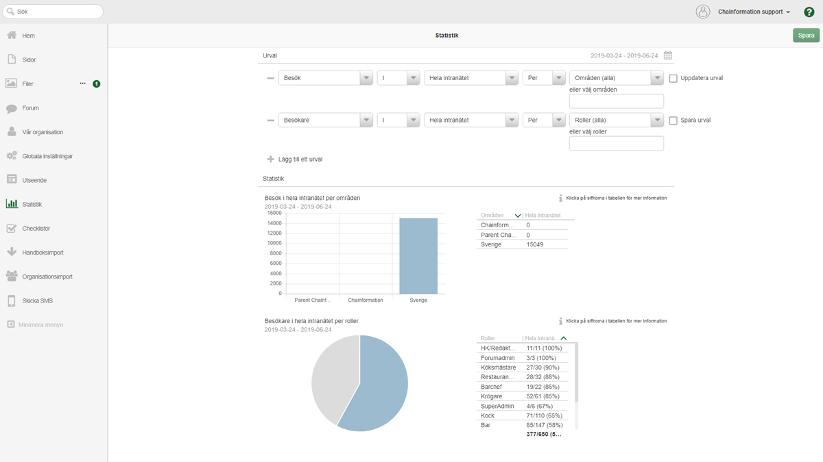
An existing web application had this old fashioned statistics module. The application collected a big amount of data from user interaction, but for a user, it was hard to obtain this data from the statistics tool and even if they were able to obtain the data they wanted – it was hard to read it. Basically the interface was hard to grasp and the data visualization didn’t meet up to user’s expectations. As owners of the product we kept getting questions like ”How can I find this data?” and ”why can’t I see this and that?”. It also seemed that a lot of the data presented didn’t really give the user any useful intel, instead it often confused them, ”Why do I need this?”, ”What does it mean?”.
We had to re-design this statistics tool with a user centered approach. By listening to users frustration, we realized that we need to acheive the following:
- Make it easier for users to obtain the data that they want.
- Make sure the presented data is appealing and easy for users to understand.
- Remove redundant data that may confuse users instead of giving them useful intel.

UX Solutions
Going into this project I already had a lot of feedback from users to lean on, our marketing team also provided additional valuable feedback and thoughts from our customers and users. In addition to what we already knew, I used written surveys and phone interviews with some of our core users to learn more about their wants and needs. This helped me figure out what type of data to focus on first – what’s most essential for most of our users. It also gave me valuable information about what data was entirely redundant.
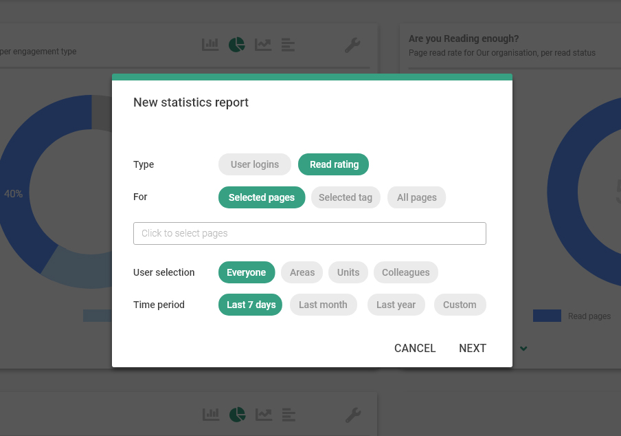
Since the old design had such a complicated interface and tools to create new reports. My main focus was to make the tool for generating new reports as simple and intuitive as possible. Removing redundant data types and other unnecessary elements really helped in this task. I further simplified the userflow by hiding or revealing some options depending on choices you make when preparing a new report. This way, the user isn’t flooded with unnecessary options on the screen, this makes the user feel more relaxed when working with the tool.
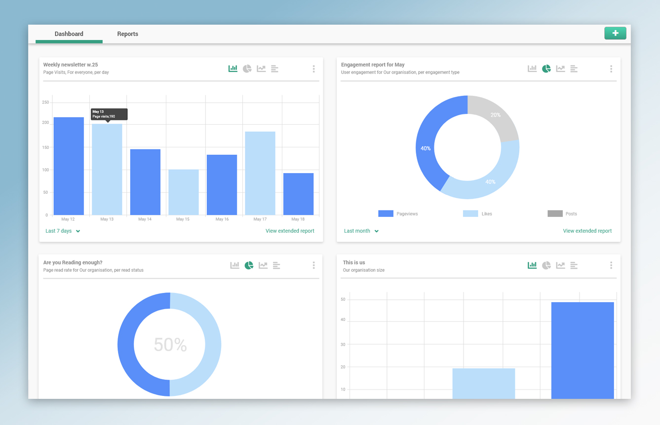
In addition to making the process of creating new statistics reports easier. We allow users to easily embed their reports on their personal statistics dashboard where data is visualized in way that gives them a quick and easy overview of the data in the report. If they want more details they can click to explore the extended report and download the data as an excel document.
While the old tool required each report to have set dates. Reports can now have dynamic time period, like ”the last 7 days” which will always show data for the last 7 days, counting from today’s date.

Final notes
”Less is more” applies to more situations than you might think and this project is no exception. We removed some functionality that we couldn’t prove being important. The only reason it made it in the first version was because someone thought it sounded like a good idea. This time we chose to only implement what’s really important and setting a standard for how the tool sohuld work, almost like ”building a frame”, kind of. So that if we find a real need for more statistics types later on, we can easily implement it using the frame that is already made.
I was the single UX designer working on this project, my work included:
Research
User research – interviews, surveys and feedback from the previous design.
Researching and analysing existing statistics tools.
Usability testing
Testing prototype of new design on core users.
Sketching and wireframes
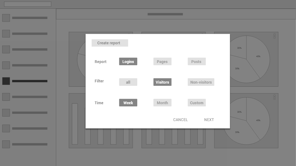
Getting quick feedback solutions from product owner and other stakeholders.
Prototypes
For feedback and testing.
UI Design
UI design for user stories and implementation.
Implementation
Coordinating developers, providing them with user stories and details for implementation and product release.
