Store communications and digital signage
Project type
A duo project together with a colleague UX researcher for a client, where we created a concept design and an interactive prototype over approximately 6 weeks.
Background & problem
Our client is one of Sweden’s largest chains for grocery stores. For the privately owned stores in the chain, our client offers a digital solution for in-store communication (Digital signage). The system helps ensure store communication that meet certain quality and that is streamlined and coherent throughout the chain.
Despite some previous efforts from our client to improve flaws this system they had a problem with decreasing number of stores subscribed to the service.
Our goal was to create a concept with an interactive prototype displaying a solution that our client could use as guiding decision support for larger strategy and roadmap work to create a more effective store communications system together with more stakeholders.
Stakeholder interviews, workshops and gathering of data
In order to get better understand the current solution we performed various stakeholder interviews workshops. Talking to product owners, project managers in charge of previous improvements, and external stakeholders that are affected in different ways. Through different stakeholders we got ahold of some existing research data and statistics that would help us forward.
These talks were super important for us and helped us understand and see a much larger complexity than we could initially see. This system was just one small part in a much larger machinery of systems and stakeholders. We also realised that there was a lot of existing ideas and insights made on assumptions and ”gut feelings” rather than actual research data and we knew from the start that we were gonna have to validate.
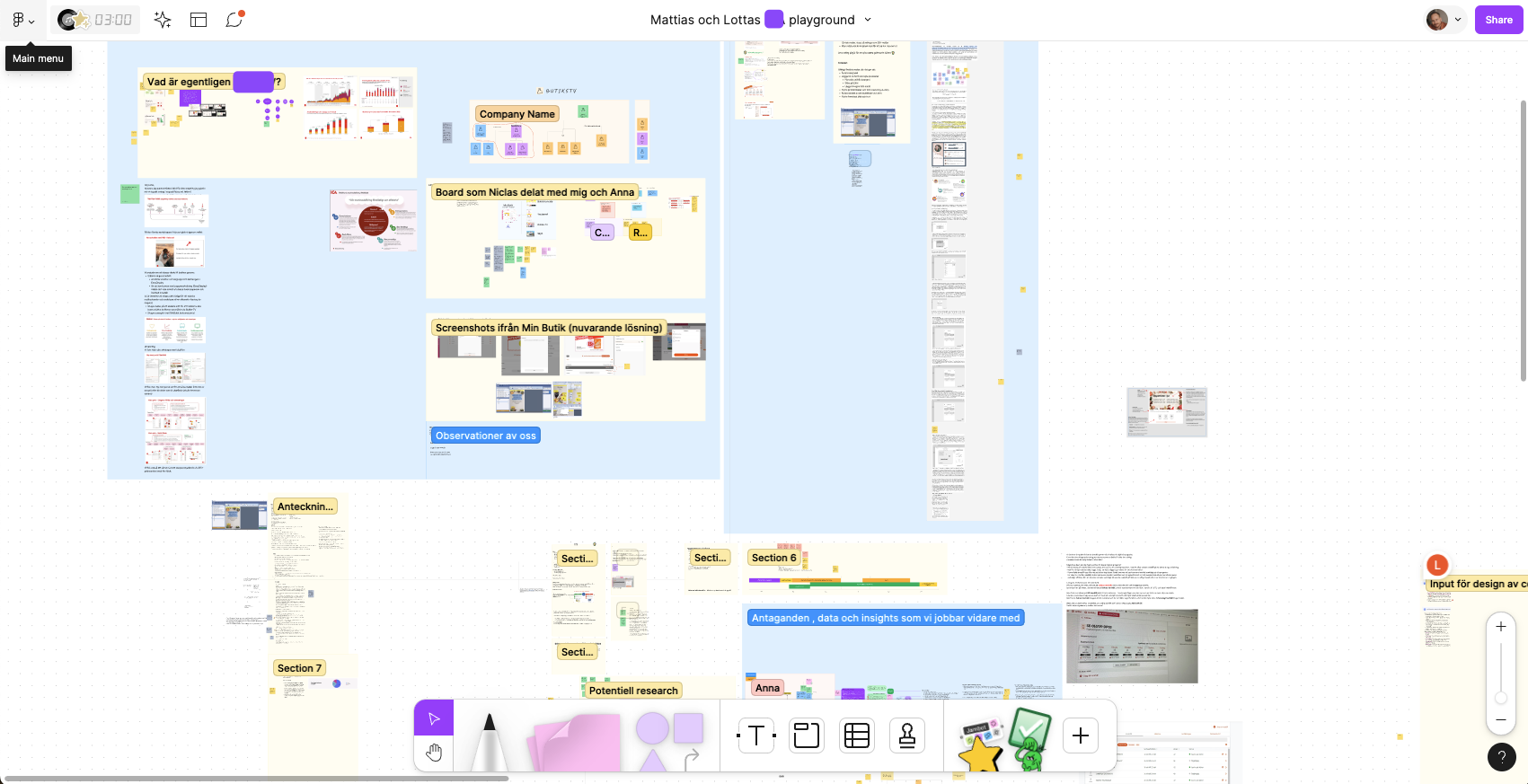
These talks continued regularly throughout the entire project to make sure we are aligned. We used Figjam for a common collaboration space where we continuously added insights, questions, discussion and workshop outcomes that all participants could revisit at any time. We also used this space to plan research sessions and share our project plan and timeline with our client.
User interviews and observations
In order to understand the needs and pains that the current users were having, we arranged meetings and calls with them in some of the stores where we could see a decreased usage of the system. Where possible, we visited the stores to meet and talk and to do observations both of the employees way of working but also to see the current solution at work in and around the grocery stores.
Due to limited time and the fact that the users we needed to talk to were often very busy we also met with some of them over video calls.
Both the physical meetings and video calls were recorded for analysis as part of our research but also as part of additional deliverables to our client after the project.
During these meetings, we started seeing indications that the flaws with the current communications platform was just one part of a larger and a bit more complex problem and that ultimately a solution should involve more than just an improvement of this. However, the software was a big part of the problem and due to what was being requested by our client, that was where we were gonna put most of our effort.
Most of the users we met with was excited to be part of the project and welcomed us back later on for testing and feedback sessions of our sketches and prototypes.
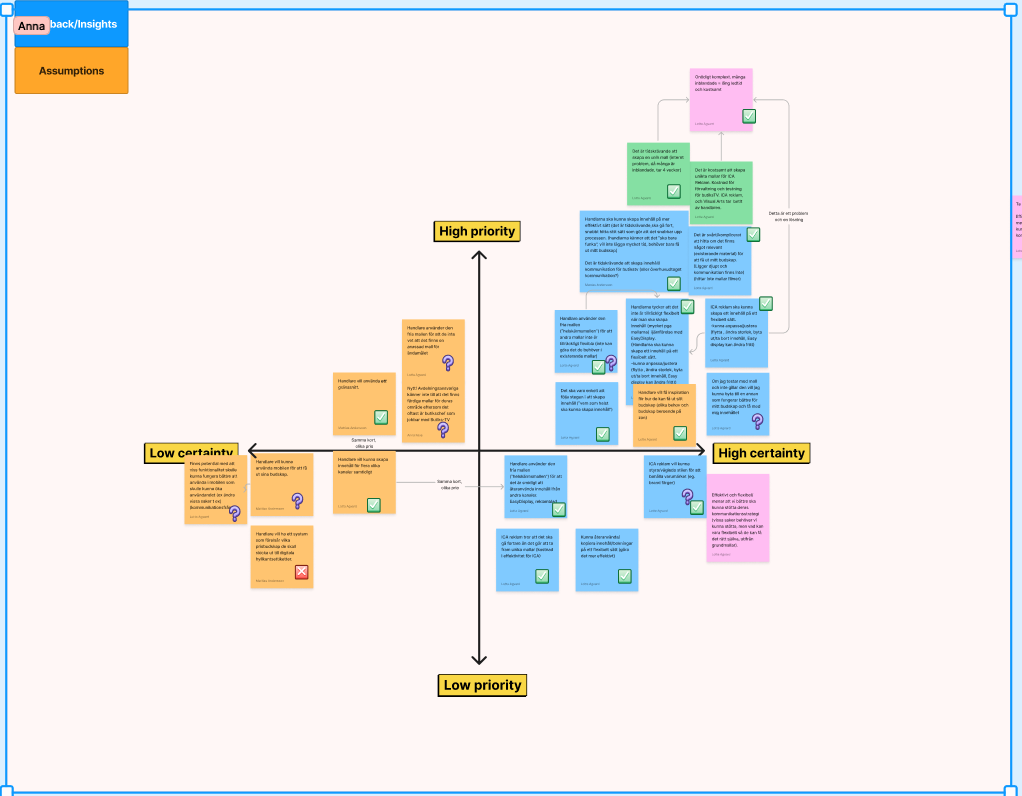
Priority and certainty matrix workshop
Together with some key stakeholders we had some workshop sessions where they mapped out different insights on a matrix to understand how certain they were about different insights and/or if they were just assumptions or actual data insights. This helped us prioritise things in our design and understand where we might need to do additional research. We did this in Figjam over video calls and in our office.
Pains and challenges
Through our research we discovered a number of pains and challenges for our users related to the current solution. Some key ones that we addressed in our solution:
- Finding and using relevant communication content is too hard.
- Users want to be able to personalise the communicated content to better reflect their unique store.
- Users are required to use multiple platform to communicate through different channels which leads to fragmented communication. This also leads to a disruptive way of working which costs a lot of time for our users.
User tests & prototype feedback sessions
During the design process we did created several prototypes that we tested together with workers from the some of the stores we visited or talked to during our main research phase. Just like the interviews, some tests was made on site in the stores and others was made with a a shared Figma prototypes over video calls.
We used all the valuable feedback and insights we gathered through these tests to improve and iterate on our design.
Solution
These are some key areas in our solution that we focused on to meet the most important needs and pains.
Enable users to quicker find and use relevant content for communication.
Based on these insights:
- Users tend to work out of habit and don’t actively look for new or different things in the application.
- Relevant content is hidden deep into the application.
- The way content is categorised and displayed does not encourage users to explore and find new relevant content.
Key elements in our solution:
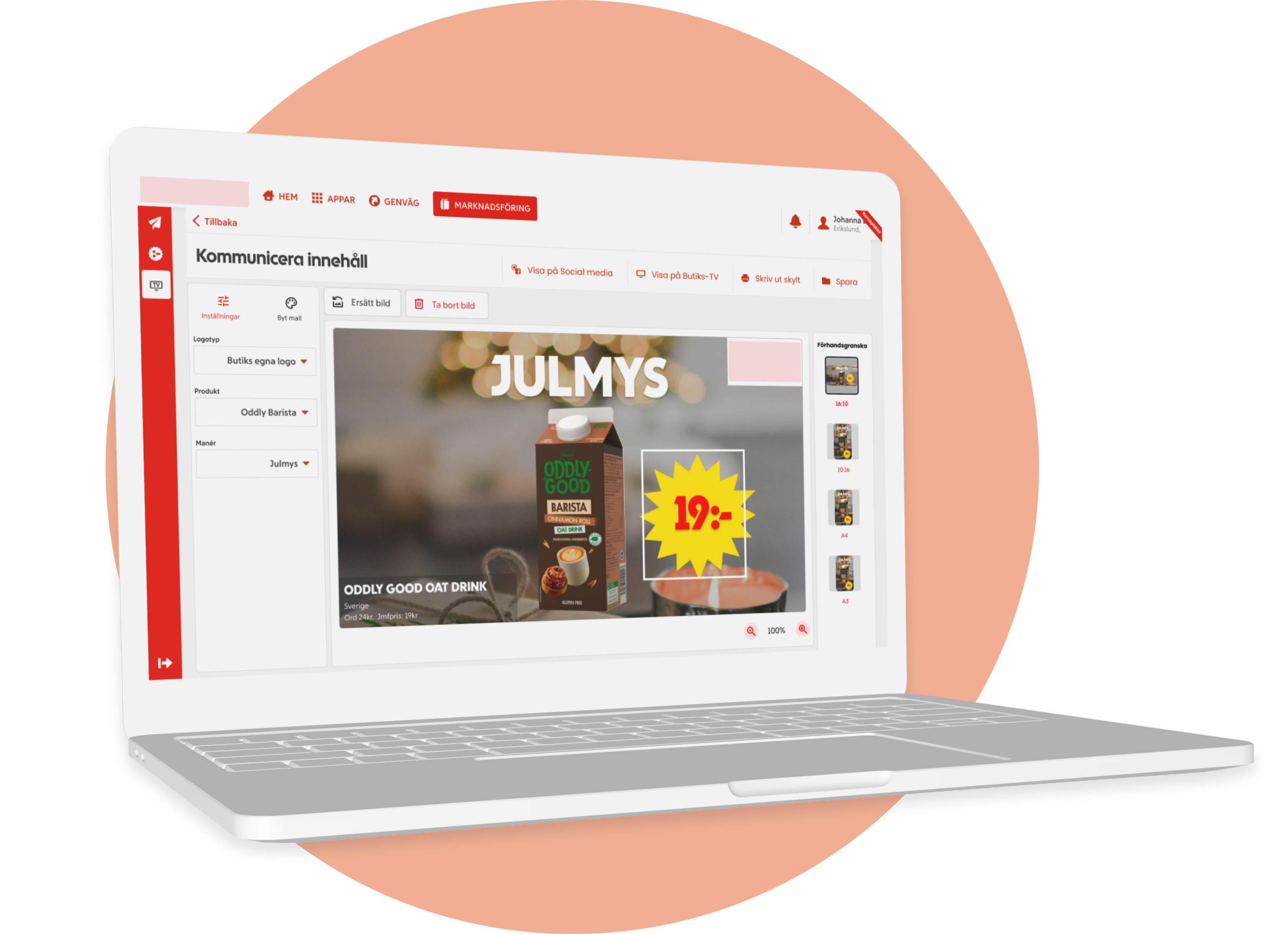
- Turning the user flow around. In the existing solution, users have to go through many steps before they can start creating the content they want to display/communicate. In our design, finding the content you want to display is the very first step in the work process and we display existing content in a way that highlights and showcases new content right away.
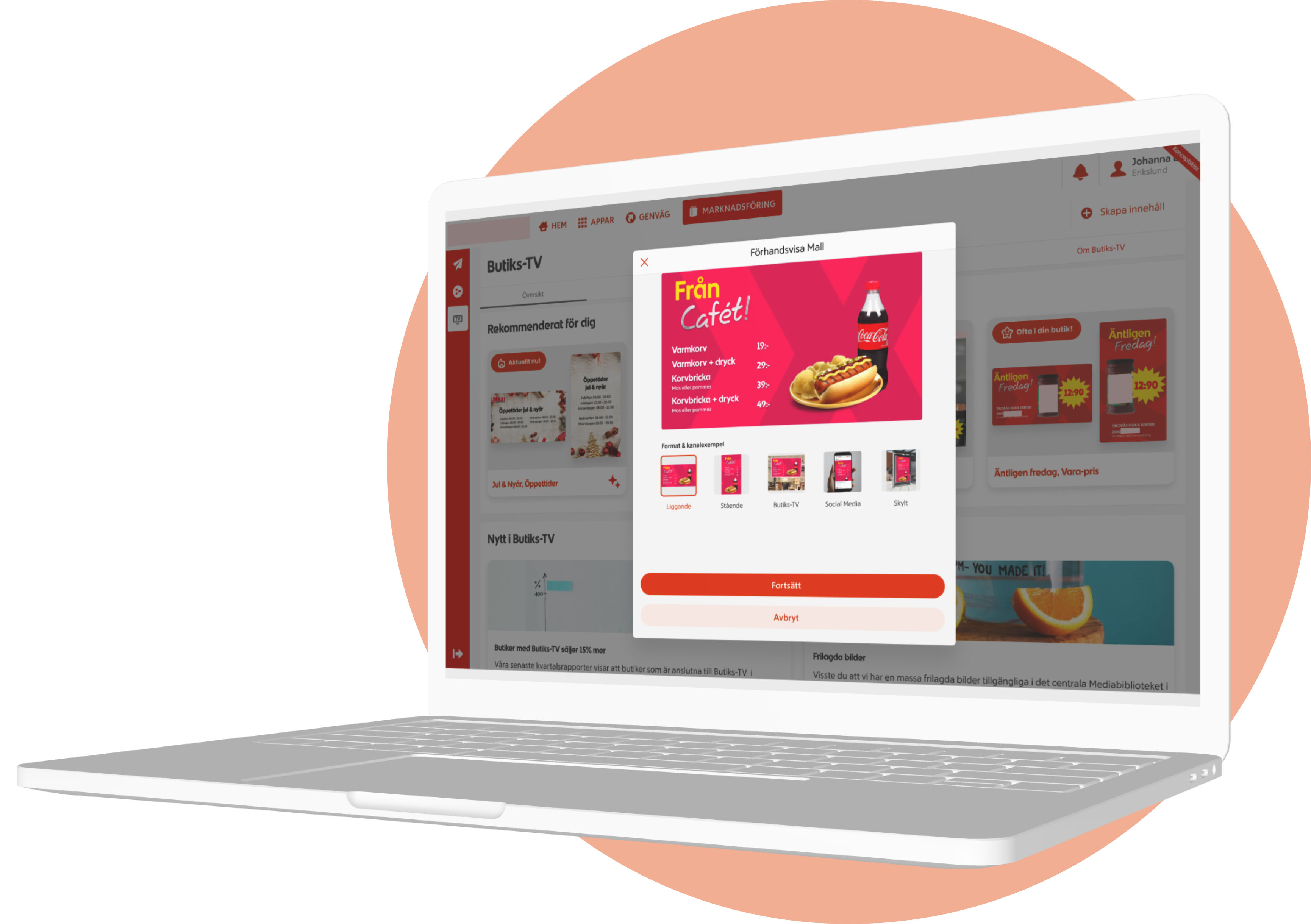
- A new landing page with a visual content feed and other relevant information. An intelligent feed that sorts content depending on the current user, trying to predict what the user wants before they even know. This visual feed also encourages users to explore more which makes it easier and more likely that they will discover relevant content. Other relevant information such as blog posts and data highlights and fosters a better understanding of the value and what the service is capable of, which makes it more likely for customers to keep re-subscribing to the service.
Make it easier to adjust template content so that stores can maintain their unique touch.
Based on these insights:
- Users have developed a habit of using multiple systems just to be able to produce the content they want for communications. Because doing so is too complicated or not supported in our client’s application. Often, small adjustments are enough to add their store’s unique touch.
- Users can’t create new original content when there’s no fitting existing content or template – instead their only option is to upload a static image with the content, produced elsewhere.
- Adjustments of existing content and templates are too hard. Users don’t understand how a change will affect the content or how to change a specific detail.
Key elements in our solution:
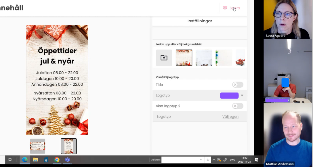
- When pre-made content or templates are used, the store’s own logo and background image are automatically fetched and embedded in the content – providing a more store-unique touch.
- An easier and more flexible way of adjusting existing content and templates.
- Content is responsive and automatically adjusts for different channels and formats.
Make it possible to publish content to different communication channels from a single space.
Based on these insights:
- Observations and interviews showed us that our users’ way of working could be more effective by providing them with better tools that allowed them to perform more tasks from once single space.
- Doing similar tasks in many different places and at different times causes a fractured experience and store communication.
Key elements in our solution
- While the existing solution is only for publishing content on digital in-store displays, our solution offers a way for publishing to more channels from one place where content is responsive so that users don’t have to create multiple versions of material they want to communicate. Simply create one version of the content you want to communicate and then allow the application itself to adjust it for different formats and channels while maintaining coherency to avoid a fractured way of communicating. E.g. a user creates a landscape version of some sort of message. The application can automatically adjust it to suit portrait displays too, as well as ads for common social media channels such as Facebook & Instagram.